The Color Matching Techniques of Hanfu Have So Many Profound Secrets!
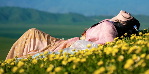
Spring passes by in a flash, and summer arrives quietly. When it comes to how to achieve a vibrant and lively feeling of summer through color matching, I think there’s no style that can surpass Hanfu in terms of boldness in color combination! I’d like to share some of my observations with you.
Ⅰ. Hanfu Always Looks Stunning
When I bought Hanfu before, I just bought whatever caught my eye. In the past couple of years, I fell in love with Hanfu. At first, I bought complete sets in a proper way. Later, I started to buy only certain items in a set. And then, I directly searched for individual items and even did some DIY by myself.
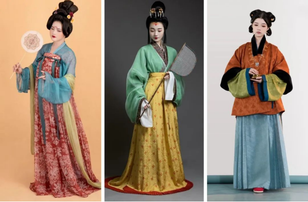
I discovered something amazing: those colors that would look flashy, strange, or old-fashioned on regular clothes don’t look bad at all when used in Hanfu color matching. Sometimes, they even look unexpectedly great!
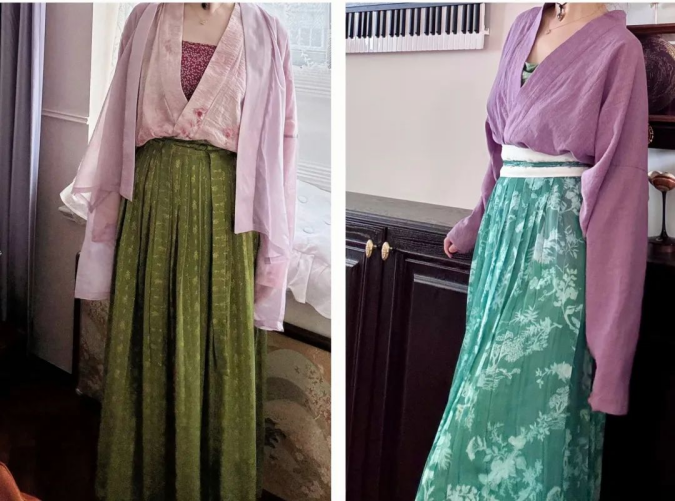
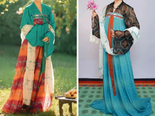
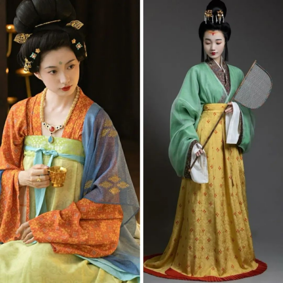
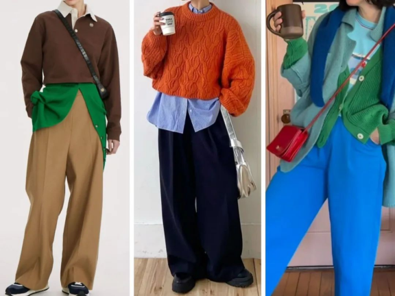
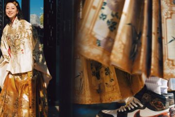
For example, in the case of regular clothing, I would never consider combinations like “pink + yellow-green” or “red-purple + dark green”, but these combinations work well with Hanfu.
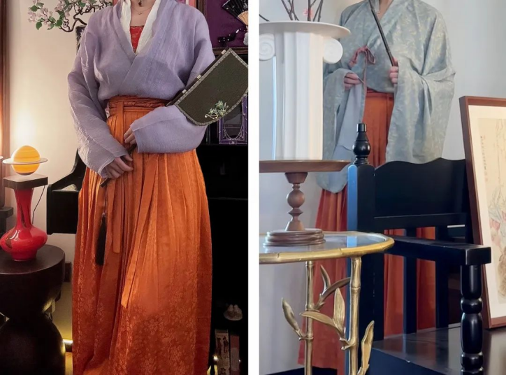
I wouldn’t even attempt combinations like “pale purple + bright orange” or “sky blue + bright orange”—they sound challenging right off the bat. But somehow, these color pairings look surprisingly harmonious on Hanfu.
When it comes to regular fashion, I’d never even consider adding super vivid pieces in shades like yellow-green or bright orange to my wardrobe. Why make my everyday outfits more complicated? It’s just asking for trouble!
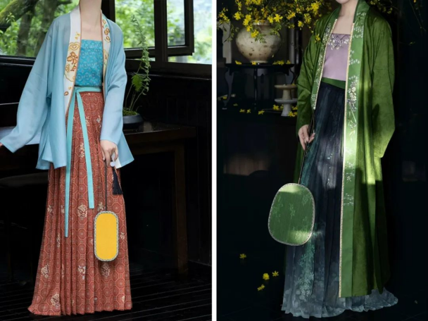
However, with Hanfu, those eye-catching, high-saturation colors work magic. Whether you’re matching an upper garment with a lower one or layering multiple pieces, it seems like you can mix and match all sorts of colors, and they’ll still look perfectly coordinated and beautiful.
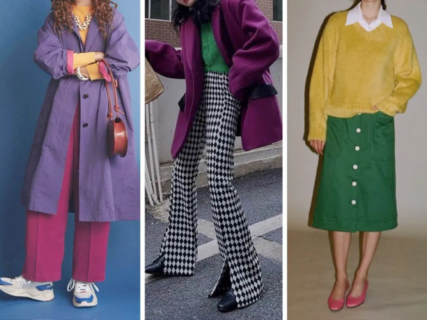
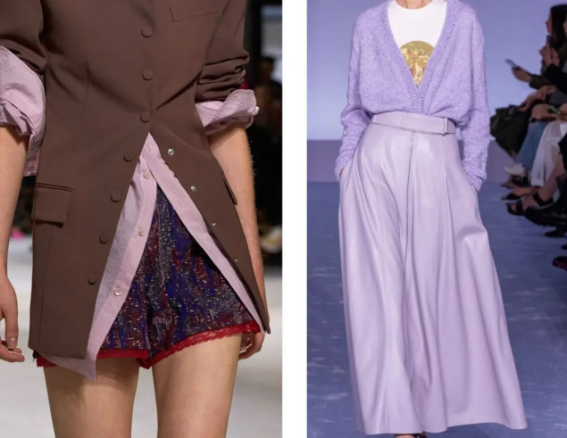
Let’s first take a look at why the fashion world has the rule of “no more than three colors in an outfit.” The reason is actually pretty straightforward: if your everyday clothes are a mishmash of colors like this, the overall look ends up chaotic and lacks sophistication.
Ⅱ. The Three-Color Principle Fails in Hanfu
The well-known axiom in the fashion world, “No more than three colors throughout the whole outfit,” seemingly doesn’t work at all when it comes to Hanfu styling! So, why on earth is that?
The reason is actually quite simple and down-to-earth. If you dress in an outfit full of various colors like the following examples, it will look messy and lack texture. It’s not just that having too many colors makes it hard to have a visual focal point; it’s simply that these patches of fabric look disorganized, greatly reducing the sense of fashion.
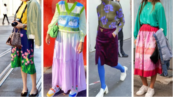
For most ordinary people in their daily lives, the “no more than three colors throughout the whole outfit” rule is easy to follow! Whether it’s for going to work or socializing, it mainly ensures that you won’t make mistakes.
However, I like to get to the bottom of things. Eventually, I think the essence of it is that: Modern fashion, which is based on Western clothing, mostly features three-dimensional tailoring. It has front and back pieces, precise sleeve widths, and line for division. As a result, there are a lot of cut pieces, and each piece isn’t very large.
For this style that is pieced together to perfectly fit the body, the “surfaces” where colors can be displayed are quite limited. The curved surfaces formed by stitching further fragment the integrity of the color blocks. If the whole outfit is full of various colors, it will definitely look messy and chaotic.
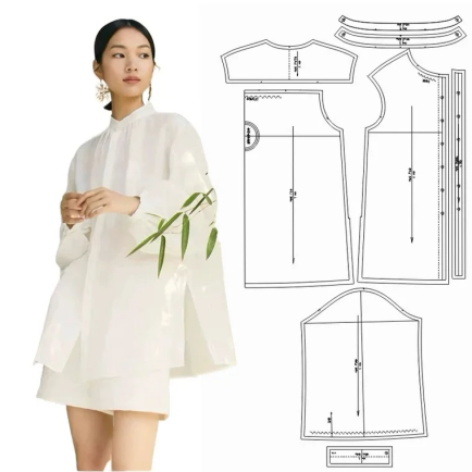
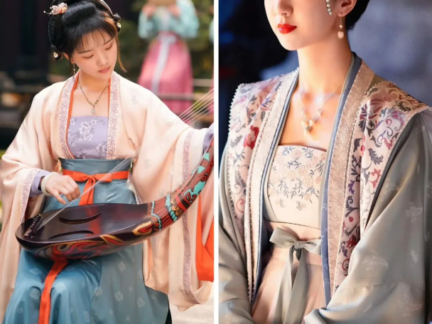
As for Hanfu, it adopts flat cutting. The shoulders and sleeves are on the same plane, and there is a large amount of fabric allowance, providing enough space for colors to show off. A piece of Chinese outfit only requires several rectangular pieces of fabric.
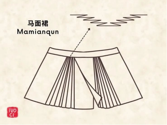
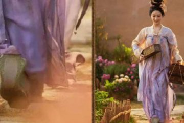
What’s more, the lower part of the skirt has a lot of pleats. When it’s still, it appears in a single color. But as a person moves, these pleats open and close, and the hidden color details appear and disappear, creating a dynamic aesthetic in dressing, such as mamian skirt.
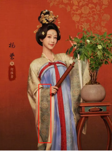
Also, whether it’s a short or long Hanfu, the unique collar design of Hanfu, when worn in the “straight collar style”, can create a symmetrical color area that extends directly down to the lower skirt vertically. It naturally connects the upper and lower parts, and it seems that the color blocks don’t look abrupt at all visually.
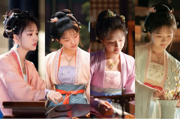
When worn in the “crossed collar hanfu”, it forms a “Y-shaped” line with a clear visual guide, drawing the focus to the waist of the skirt and “restraining the visual flow”. The horizontal line at the waistband of the skirt not only serves as a “convergence” of the color blocks on the upper body but also acts as the “opening” of the colorful picture of the entire lower skirt.
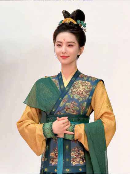
As a result, the upper and lower proportions, the primary and secondary color blocks, and the harmony are clearly defined, allowing multiple colors to coexist in a coordinated and integrated manner.
This is a kind of color aesthetics based on the structure and proportion of the clothing. It’s like setting up a framework, and then you can freely fill in the colors as you like, experiencing the freedom of dressing and color matching that follows one’s heart without going beyond the rules.
Ⅲ. Dressing and Color Matching Techniques
However, although the structure of Hanfu is ingenious, we still have to wear regular clothes for work in our daily lives, right? Therefore, the following are some dressing and color matching techniques that I have sorted out and summarized, which I have learned from Hanfu and can be applied to our daily outfits:
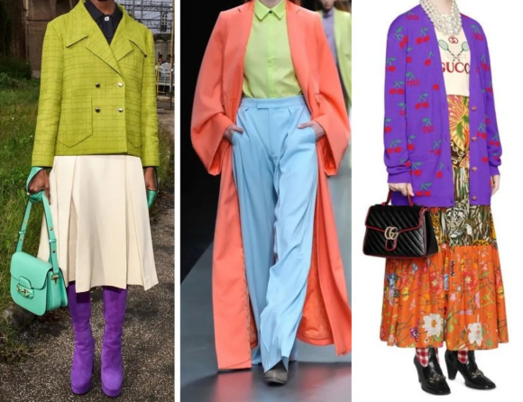
When there are more than three colors on your body, the proportion of large color blocks should not be 1:1:1, otherwise it may look extremely messy. No matter how bright and flashy the color matching of Hanfu is, the area of the large color blocks on the whole body will definitely not be 1:1:1, and there will surely be a distinction between primary and secondary elements.
In daily wear, as long as you pay attention to the proportion distribution of large color blocks, bright and flowery patterns can also look quite harmonious.
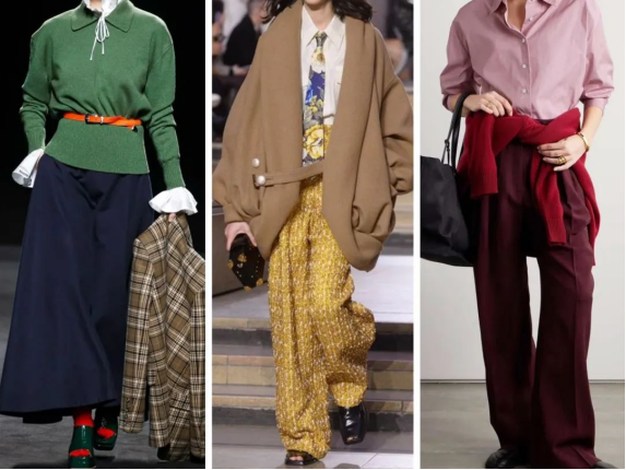
Add “transition zones” to the “marginal areas” such as the collar, cuffs, hem, and waist.
This kind of “color transition and connection” can be achieved by using scarves, the straps of crossbody bags, waistbands, clothes tied around the waist, and inner garments that show the collar, cuffs, and hem.
Layering can give simple styles a sense of spatial hierarchy.
Of course, apart from colors, we can also make use of the physical contrasts of fabric materials. For example, thin and light versus thick and heavy, glossy versus matte, draping versus stiff, full-hand embroidery versus plain satin with blank spaces… The sensory contrasts generated by the material oppositions can create a sense of “virtual-real” hierarchical transition even for the same color.
Summary
After saying all this, in fact, I’m a bit confused about whether we have chosen Hanfu or Hanfu has chosen us. Perhaps we are infatuated with Hanfu because of its thousands of years of cultural heritage, or maybe because of the attitude towards life that Hanfu represents.
In fact, everyone understands that clothing was born when we move between heaven and earth. We have created Hanfu, and Hanfu has shaped us. The mystery of the colors of Hanfu perhaps lies in our hearts. 💕
0 Comments